Anthony Dillon
on 24 November 2020
The web team here at Canonical run two-week iterations. Here are some of the highlights of our completed work from this iteration.
Meet the team

Hi, I am Carlos Wu. I work for the Webteam as a web developer, and I just recently reached 1 year at Canonical!
I have worked previously in a number of Front-end roles and Canonical and the webteam gave me the opportunity to work on both back-end and front-end, which has been my professional goal for some time. I quite like our tech stack, which includes Python and Flask, React, and we use Docker to deploy our projects, so I really enjoy working and learning in this team.
Coming from agencies and companies where managers would just tell me “Don’t ask questions, just do your work”, Canonical’s webteam has proved to be like a family, where I can be curious and ask questions and not be afraid to explore my boundaries.
In my free time, I like to do a variety of things. Sometimes, I like to play music, try as many instruments as I can. Although I have been a long time guitar player, I also enjoy playing chords on the piano or fiddling with a violin. Furthermore, I also sometimes build my own small projects to help me in my daily life. I very much enjoy a walk in the park! As you can see in the picture above in Hyde Park, London.
Web squad
Our Web Squad develops and maintains most of Canonical’s promotional sites like ubuntu.com, canonical.com and more.
CVE and USN API
We have been working on developing our new API endpoint for the server team to access our USN and CVE data.
Published resources
9 out of the top 10 US & European financial institutions use Ubuntu

Find out why multi-cloud is fundamental to financial services transformation
Ubuntu Masters 4: Innovating for the future

Sign up for the Ubuntu Masters 4
Other resources and webinars
- SQL Server on Kubernetes: the next frontier
- Industry 4.0 needs a complete automation solution
- Together We Sink or Swim: Plugging the BootHole
- Micro clouds: Building your Kubernetes edge computing strategy
Other resources
In German
- Fünf Strategien zur Beschleunigung von Kubernetes in Unternehmen
- Vergleich von Red Hat OpenStack Platform und Charmed OpenStack von Canonical
In French
In Italian
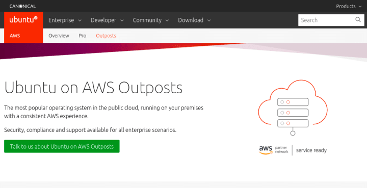
New AWS Outposts page
The most popular operating system in the public cloud, running on your premises with a consistent AWS experience.
New cloud page
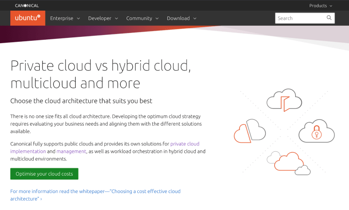
Private cloud vs hybrid cloud, multi-cloud and more. We do so much in the cloud we created a page to help you navigate our offerings.
Learn more about Ubuntu in the cloud
New Kubernetes comparison page
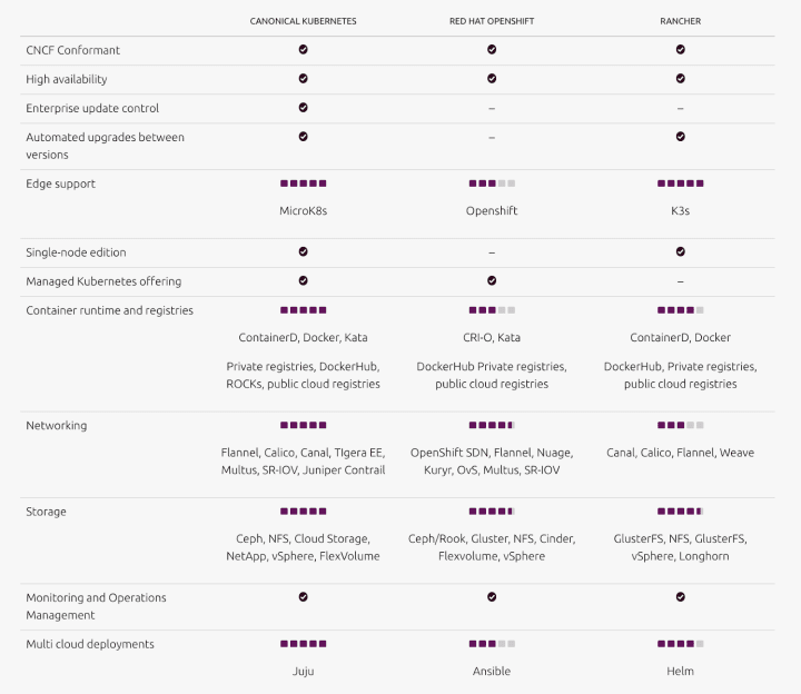
The Kubernetes landscape is vast and complex. If you are looking to compare different enterprise Kubernetes distributions, have a look at this page.
Brand
The Brand team develops our design strategy and creates the look and feel for the company across many touch-points, from web, documents, exhibitions, logos and video.
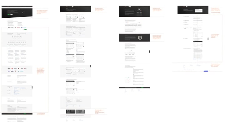
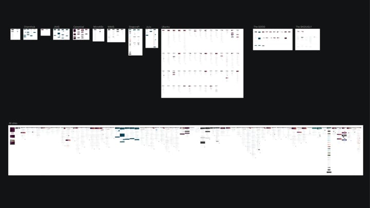
Suru across the web analysis
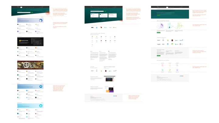
We completed the analysis of the use of ‘suru’ (our brand pattern) across all of our sites in preparation for a team workshop on Monday, where we will endeavour to expand its use and identify shortfalls and areas for improvement.
Nurture email templates
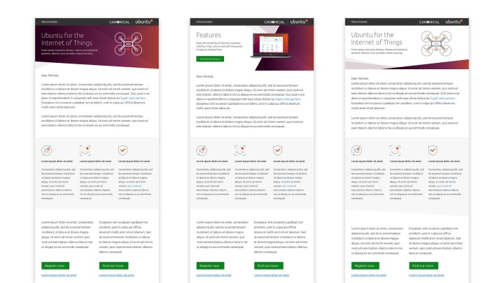
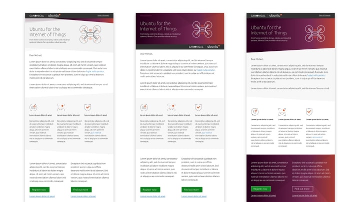
Working with the Marketing team we designed a number of templates to use in generic nurture campaigns, they will be built and distributed through Marketo.
Financial illustration library
A library of financial illustrations was developed with a focus on banking and investment for the Project Managers and the Marketing team to use.


KUSA development
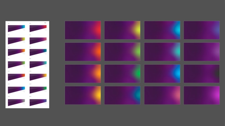
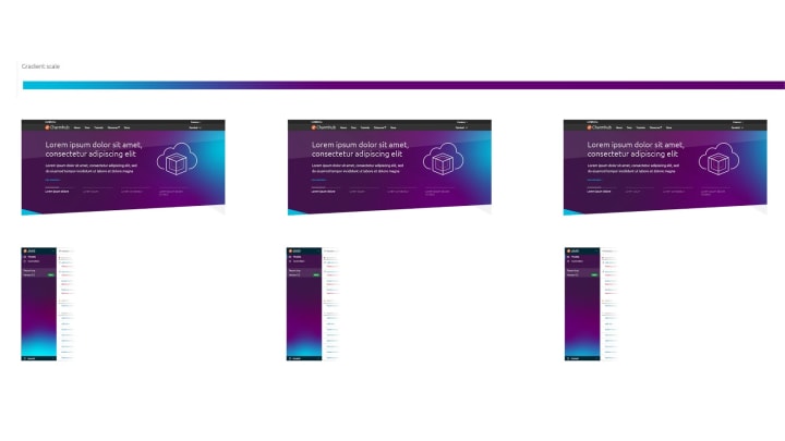
We progressed the brand development of our proposed new theme ‘KUSA’, looking at the colours and levels of saturation.
MAAS
The MAAS squad develops the UI for the MAAS project.
We continued our journey to migrate our Machine details feature to React this week, covering the Network tab and Storage tab.
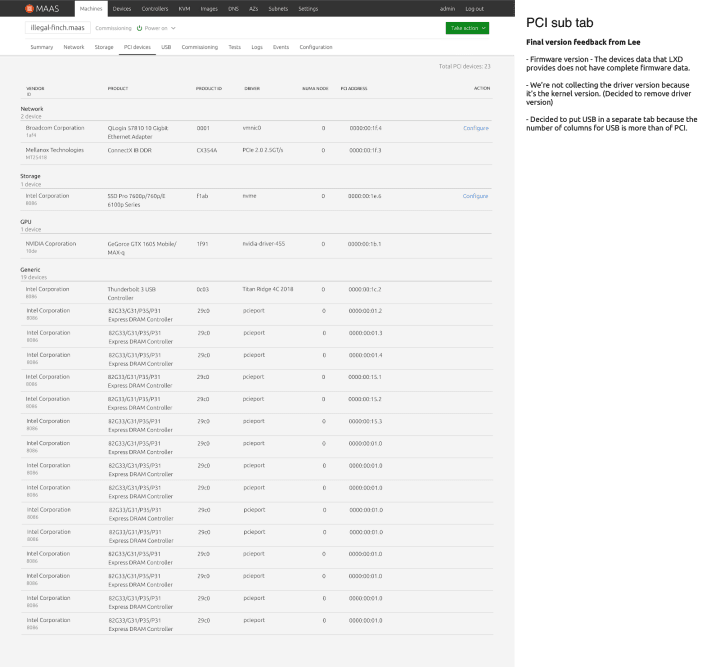
PCI device modelling
On the UX side, we have finalised our designs for PCI modelling work and from now, users will be able to see hardware information of the PCI devices from our UI already. The current PCI device modelling feature covers PCI devices and USB devices. From the aggregated view, information on the vendor, product, location and driver are provided. The network section includes information on normal networking cards and SmartNIC if available. Configurations can be done on two groups of devices; network-related devices and NVME storage devices. We hope to be able to provide configuration functions for GPUs in future work. Stay tuned, for development!
Machine workload annotation
Another piece of research work the UX team is working on is the machine workload annotation feature. The purpose of this feature is to bridge the communication gap between Site Reliability Engineers (SREs) and Data Center Engineers. The underlying problem at the moment is to understand how each side our users work and how they interface with MAAS. The current assumption is that SREs interface with MAAS through an orchestrating tool like Chef, Juju, Ansible, puppet, etc. This means that information we provide on MAAS need to be available in CLI and in the UI for the purpose of interfacing with these orchestrating tools.

JAAS
The JAAS squad develops the JAAS dashboard for the Juju project.
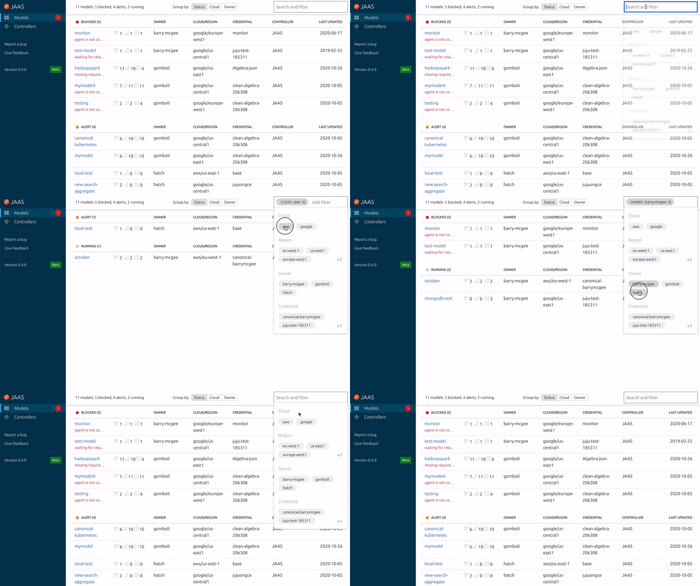
We landed a major new feature this iteration, the revised search and filter component. This is now using a shared component from our React Component library. This component is populated by the available model attributes and then filters the models whenever the user selects one of those filters. It is responsive, keyboard accessible and supports free form fuzzy search.
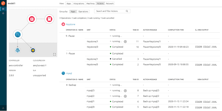
Juju action on dashboard UX design
In this iteration, we improved the dashboard UX design of the new Juju action feature sets, focusing on displaying available actions in the app, selecting units to execute/cancel actions and view action pipeline in the action tab view. Continuous feedback gathering will be carried out in the next iteration.

New layout UI design update
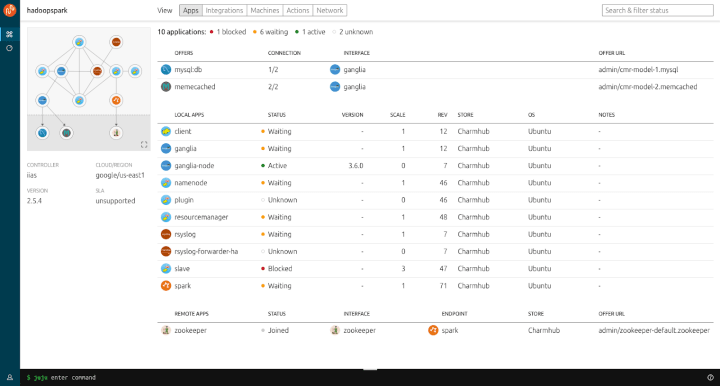
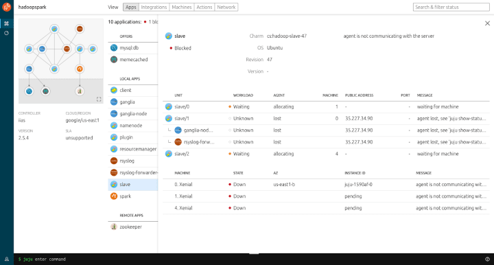
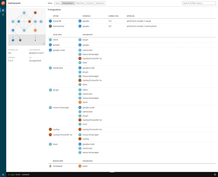
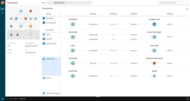
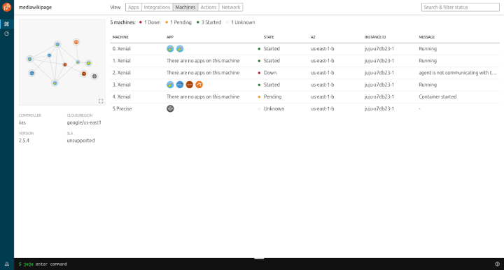
We’ve been busy updating our UI to be more streamlined with the level of information we show at a given time and added some new enhancements such as the Relationships view on the Integrations panel.
Below are some sample screens of the UI updates. We’d love to hear any feedback from our users and will continue to improve the experience in upcoming updates and release.
Vanilla
The Vanilla squad designs and maintains the design system and Vanilla framework library. They ensure a consistent style throughout web assets.
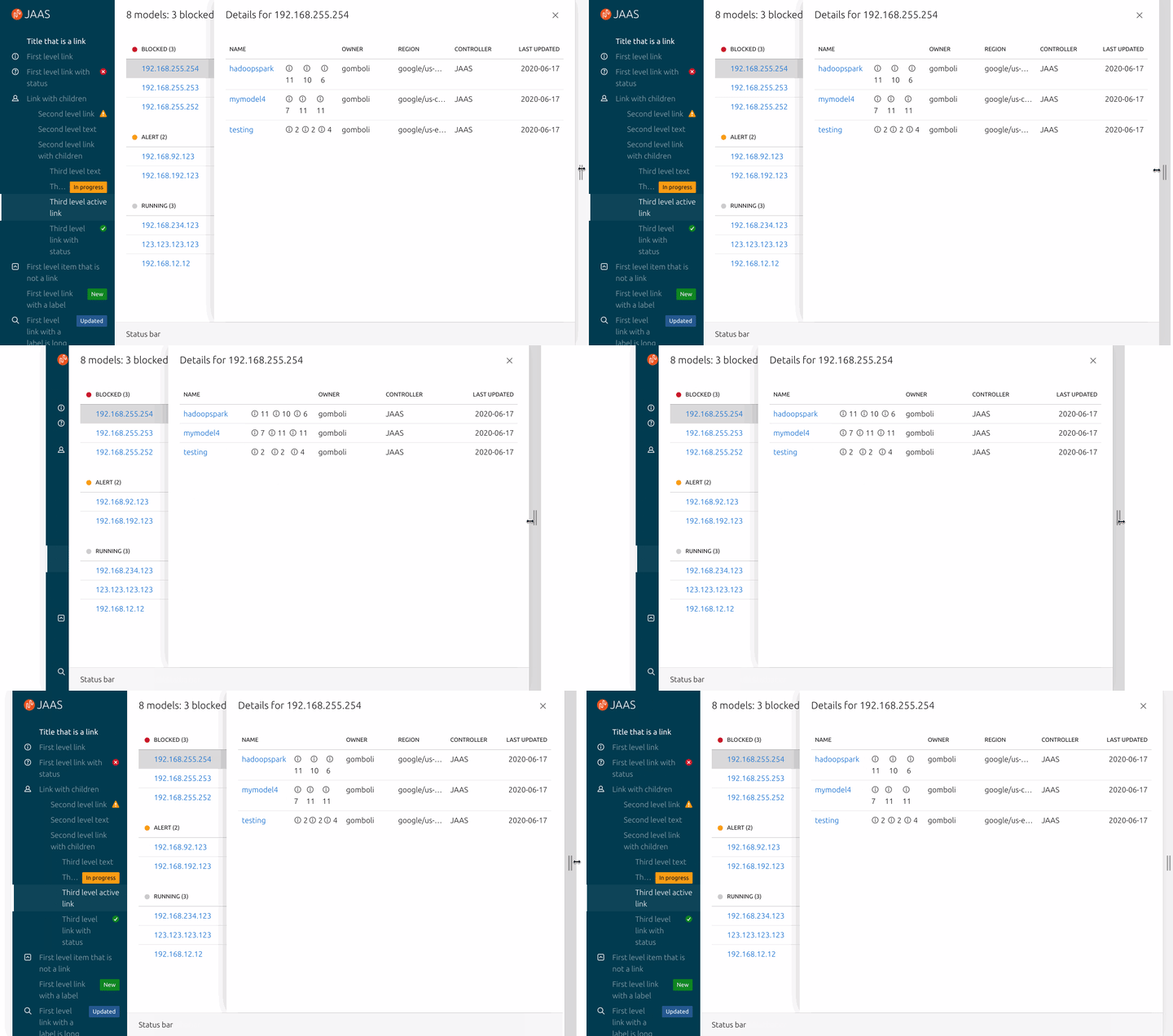
Improvement to application layout responsiveness
We continued work on the application layout. During the last couple of weeks, we improved how the layout adapts to different screen sizes, and we provided a couple of built-in widths for the aside panel.
We also provided additional examples to demonstrate how to build specific layouts of the application and documented the ways application developers can customize the layout to the individual needs of the apps they build.
New button variants
We worked on upstreaming some of the custom styles used in our React components library to Vanilla framework. This iteration we focused on the buttons and introduced updated styling for small and active buttons.

Patterns UX design
Work continues on our unified Notifications pattern, we hope to demonstrate some mockups soon. The draft pattern for our update to Code Snippet is still open for community feedback on Discourse.
Vanilla 2.20.0 release
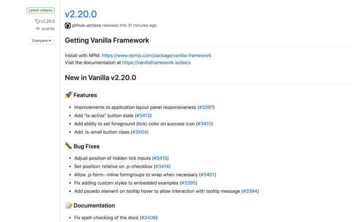
Last iteration work was released as Vanilla framework v2.20.0
.
Snapcraft and Charmhub
The Snapcraft team works closely with the Store team to develop and maintain the Snap Store site and the Charmhub site.
Snapcraft
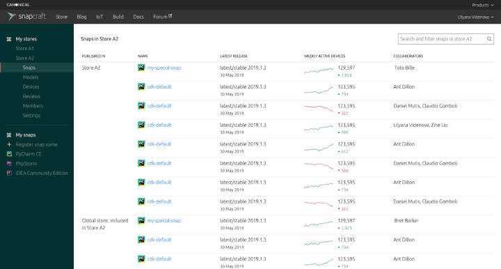
Brand store admin pages
The team has been working on designing the brand store admin pages. This work is done to continue the migration of the remaining features from dashboard.snapcraft.io to snapcraft.io.
UX update metadata
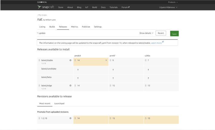
We designed the minimum required messaging around the new feature of updating metadata on release. Updating metadata on release is a handy way to always keep the snap listing up to date if any of the metadata information changes when releasing a new version to the stable channel. Currently, any changes to the snapcraft yaml file are simply ignored by the storefront, however, with the introduction of this feature they will be applied to the listing page.
Charmhub
Charmhub.io was released. The team has been working on this release of the site. Here are some highlights.
Homepage
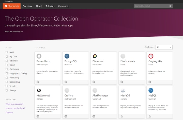
We have been working on the user experience of the homepage. On the initial load of the homepage we show a set of featured charms. In the background a list of operators is loaded to give further functionality such as search and filtering by category or platform.
Details pages
Each operator has a details page. All the information about the operator can be found in different tabs:
- The Overview is where you get information about the operator including the Readme and project links.
- The Docs tab is the author’s documentation for the operator. Freeing the description to solely be about the project.
- The Configure tab displays the configuration options when deploying or maintaining this operator.
- Actions list the available actions for the operator which provide a method of triggering internal actions on the operator itself.
Publisher pages
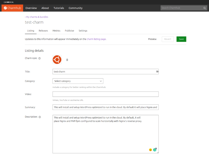
The team started integrating a publisher section on the site. We integrated the APIs into our Python module canonicalwebteam.store-api. This module handles the API calls made to the store related to Charmhub.
Team posts:
- Code snippet pattern – design specs
- Communication in code: Writing expressive code
- [Research] Cloud-like Experience in MAAS
With ♥ from Canonical web team.


