Peter Mahnke
on 18 February 2020
The Web and Design team at Canonical looks after most of our main websites, the brand, our Vanilla CSS framework and several of our products with web front-ends. Here are some of the highlights of our completed work over our last two-week iteration.
Web & Brand squad
Our Web Squad develops and maintains most of Canonical’s promotional websites.
Tutorials
We have rolled out instances of tutorials to ubuntu.com and three of our product websites.
The tutorials are now maintained in the logical discourse for each site and pulled into the websites. This allows people to contribute to existing tutorials and help create new ones.
Anbox cloud
We released the anbox-cloud.io site last iteration This iteration we have been working on the logged-in pages for potential customers to see the technology in action.
18.04.4 point release
To support the new ‘point’ release, we updated ubuntu.com’s download pages with links to the new images, as well as updated the checksums used to verify each download. We also updated the China and Japan websites.
You can learn more about the release on the wiki.
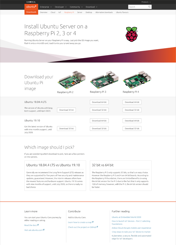
Raspberry PI download page refresh
With the 18.04.4 release, we updated the Raspberry Pi download page to make it easier to find the right version of Ubuntu to use. We also move the instructions to the thank-you page with more details on verifying checksums, how to flash your microSD card and more.
Takeovers
We built two new takeovers this iteration.
One for the webinar ‘Artificial Intelligence at the edge in a 5G world’.

And another for the ‘A decision maker’s guide to Kubernetes data centre deployments’ webinar.

Ubuntu Masters
We released an updated version of the Masters’ Conference page, featuring full keynote presentations from three well-respected speakers.

The start of a new kernel section
We are starting to roll out a new section of the website that explains a bit about the Ubuntu kernel. So far we have two pages, but a couple more will follow soon.
Supporting icons and illustrations
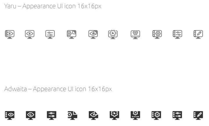
Web icons worked on this iteration

A new batch of illustrations was created for various web pages.

We helped the Desktop Team to create some new icons for the upcoming theme
Supporting marketing
We completed stand design exploration for the upcoming Kubecon event
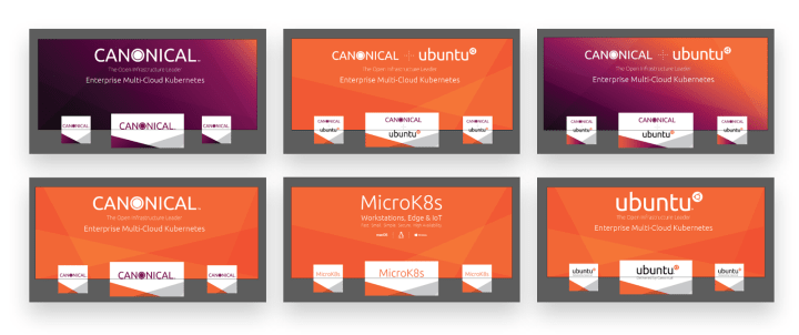
And helped Marketing generate a number of translated PDF documents

Video style exploration
Worked on developing animation styles for upcoming videos


Misc/maintenance
- maas.io is now running on a focal container and other sites will be following soon
- buy.ubuntu.com, built using Shopify, has been updated for the February rollout of the new version of their checkout
MAAS
The MAAS squad develop the UI for the maas project.
Machine listing rebuild
The machine listing rebuild in React is going great! We are slightly ahead of schedule thanks to the hard work of Huw, Kit, and Caleb. In the last iteration, we completed in-table actions, the pools tab, and nearly all of the additional hardware options.
LXD UX
As we are adding LXD as a KVM host to MAAS in 2.8 there are a number of small changes we will introduce in the next release. They will showcase the new data we have and make it easier for users to understand they are looking at a virtual machine that lives on a host, managed by MAAS.
2.7 release
The 2.7 release is coming closer and closer, we did face a number of very unexpected bugs in the UI that we fixed quickly. Currently, we have not had any bugs on our end with the last release candidate, so hopefully, this will be the last time we write about 2.7!
Specifying the shared table component
Work is continuing on a comprehensive spec for our cross-product modular table React component. Among the features specced out this iteration:
- Column visibility control
- Column resizing
- Column reordering
- Pinned row
- Row selection
- Responsive reordering of content
- Single and double row
- Dynamic summaries per table / per group of rows
JAAS
The JAAS squad develops the UI for the JAAS store and Juju GUI projects.
Report on the user testing
The team worked on the final report and analysis of the user testing done during the Product sprint in Cape Town. This report generated a conversation within the team in order to help to define the next changes in UX, functionality and UI.
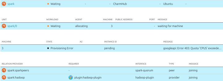
JAAS dashboard filtering
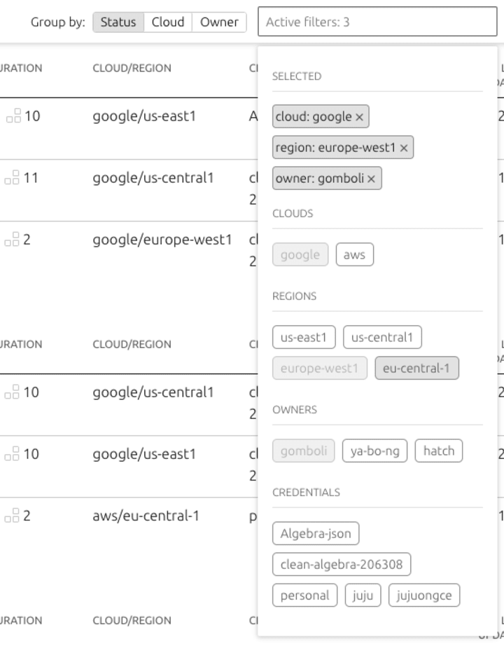
We have been working on a table filtering component which dynamically displays filterable options. The UI of the drop-down is not functional and clearly displays the values users selected to filter the list of models from the table.
Another form of filtering has been developed in the model details page. When users click on a particular application the data is filtered to related items (units, machines, relations):
Tutorials
The team implemented a new ‘tutorials’ page on jaas.ai, to collect the relevant tutorials previously published on Ubuntu.com:
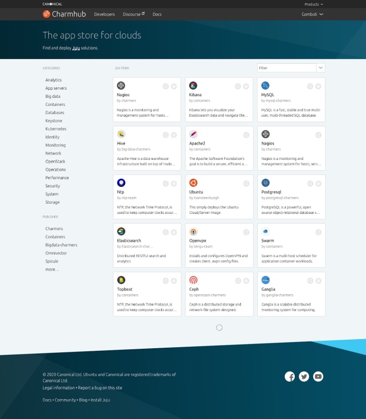
Evolution of the CharmHub store homepage
In the previous iteration, the homepage content was focused on publishing charms and testimonials from users. We have now updated the design to be more store focused, showing the wide selection of charms available. The user can also filter these charms using the list of categories and publishers on the left-hand side of the page, or via the filter and sort dropdown menu.
Vanilla
The Vanilla squad design and maintain the design system and Vanilla framework library. They ensure a consistent style across Canonical sites.
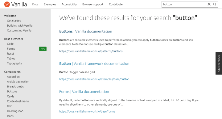
Documentation search
We’ve been working on replacing the current simple pages filtering with full documentation search for Vanilla. This should make it easier to find relevant content in the docs.
A new version of the docs site is going to be deployed live together with Vanilla 2.7.0 early next week.
Dark theme for contextual menu
We’ve worked on some updates and improvements to the contextual menu component. We added support for a dark theme to it and fixed some bugs around positioning the menu.

Maintenance
Smaller maintenance tasks that we managed to finish this iteration include fixing the placement of search input in IE11 and adding support for numbers in heading components’ variants (p-heading–1, p-heading–2, etc.) alongside existing ones (p-heading–one, –two, etc.)
Vanilla React components
The team looked at existing tables considering functionality and interactions, working on the creation of a single modular table across products. The modularity of the table takes into consideration the requirements and the use cases on product/project level.
The aim of this work is to create reusable code and consistent experience and interactions within our suite of products.
You can follow the development of the table on our Discourse posts:
SSO
The long-awaited release of the Vanillised SSO has been released to production. Please file a bug if you stumble on any issues.

Snapcraft
The Snapcraft team works closely with the Snap Store team to develop and maintain the Snap Store site.
Manually triggering new builds
We’ve been continuing the work to migrate build.snapcraft.io functionality into snapcraft.io this iteration. We’ve already done work to connect a GitHub repo to a snap but this iteration we’ve been making sure that connection is useful. The work required to build a snap manually is done, we’re just tidying up the UX. This is a large milestone in the migration as it allows us to prepare an initial version to deploy to production for feedback, which takes us to the other big build related feature we’ve worked on…
Build messaging flow
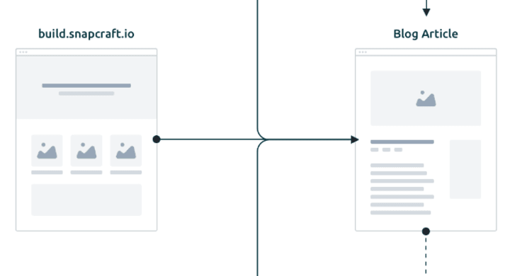
Getting the migration finished is only part of the story. The other part is to inform new and established users on the changes, why they’re happening, and what they need to do (if anything).
The strategy is based on a blog post as the main source of communication with other formats being used to reach out and link back. An email will be sent as a notification of the changes, and a forum thread will help us gather user feedback on the new flow for future improvements. There will also be messages and links to the blog post from different relevant places on both build.snapcraft.io and snapcraft.io.
Maintenance
- Updated “Show more” pattern across the site
- Snapcraft yaml example in expandable grid pattern should be truncated
Team blog posts:
- Testing your user contract by Jeff Pihach


