Inayaili de León Persson
on 4 February 2016
Today we launched a new and redesigned tablet section on ubuntu.com that introduces all the cool features of the upcoming BQ Aquaris M10 Ubuntu Edition tablet.
Breaking out of the box
In this redesign, we have broken out of the box, removing the container that previously held the content of the pages. This makes each page feel more spacious, giving the text and the images plenty of room to shine.
This is something we’ve wanted to do for a while across the entire site, so we thought that having the beautiful, large tablet photos to work with gave us a good excuse to try out this new approach.
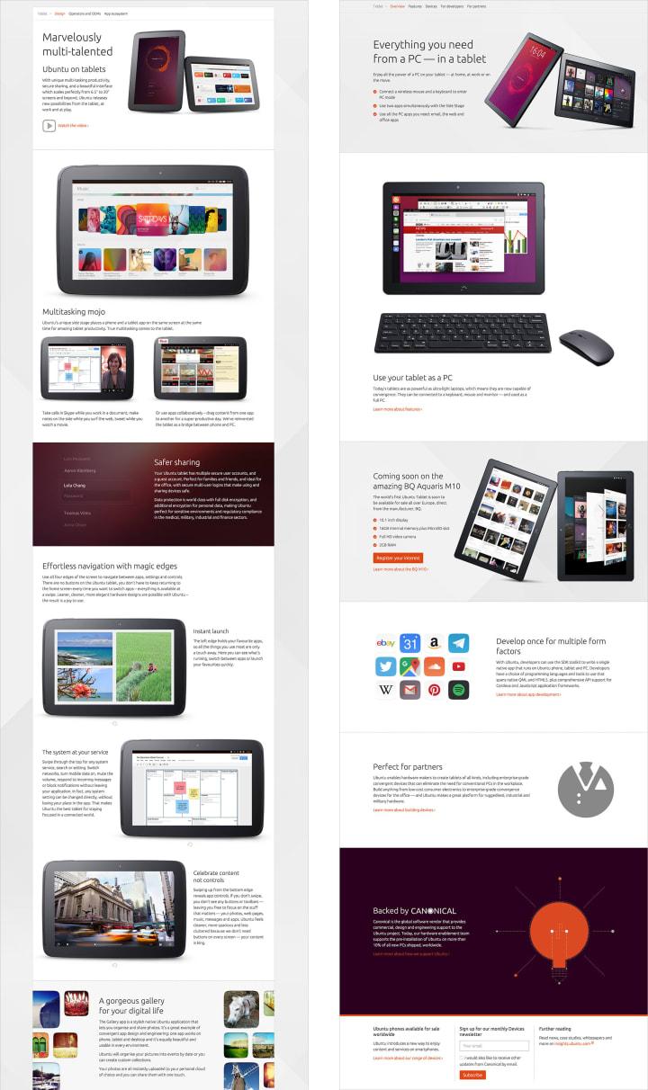
 The overview page of the tablet section of ubuntu.com, before (left) and after
For most of the section, we’ve used existing patterns from our design framework, but the removal of the container box allowed us to play with how the images behave across different screen sizes. You will notice that if you look at the tablet pages on a medium to small screen, some of the images will be cropped by the edge of the viewport, but if you see the same image in a large screen, you can see it in its entirety.


 From the top: the same row on a large, medium and small screen
How we did it
This project was a concerted effort across the design, marketing, and product management teams.
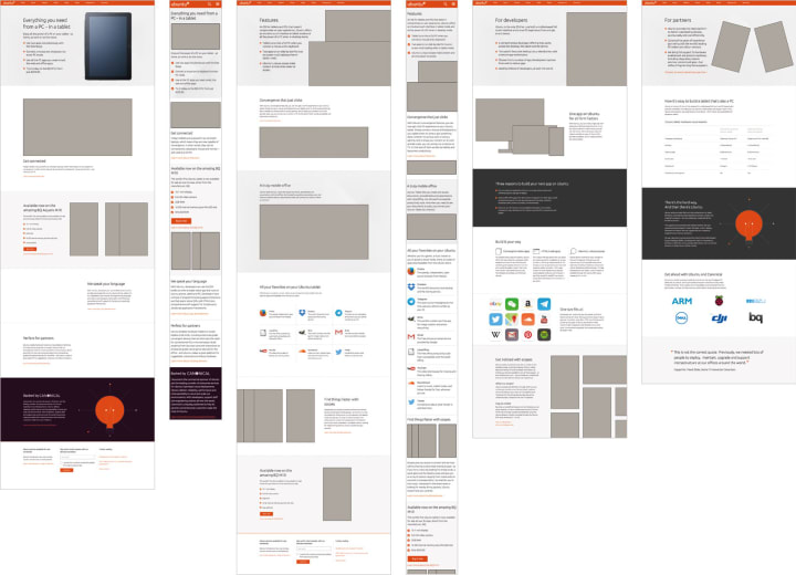
To understand the key goals for this redesign, we collected the requirements and messaging from the key stakeholders of the project. We then translated all this information into wireframes that guide the reader through what Ubuntu Tablet is. These went through a few rounds of testing and iteration with both users and stakeholders. Finally, we worked with a copywriter to refine the words of each section of the tablet pages.
 Some of the wireframes
To design the pages, we started with exploring the flow of each page in large and small screens in flat mockups, which were quickly built into a fully functioning prototype that we could keep experimenting and testing on.
 Some of the flat mockups created for the redesign
This design process, where we start with flat mockups and move swiftly into a real prototype, is how we design and develop most of our projects, and it is made easier by the existence of a flexible framework and design patterns, that we use (and sometimes break!) as needed.

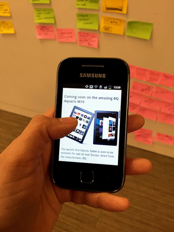
 Testing the new tablet section on real devices
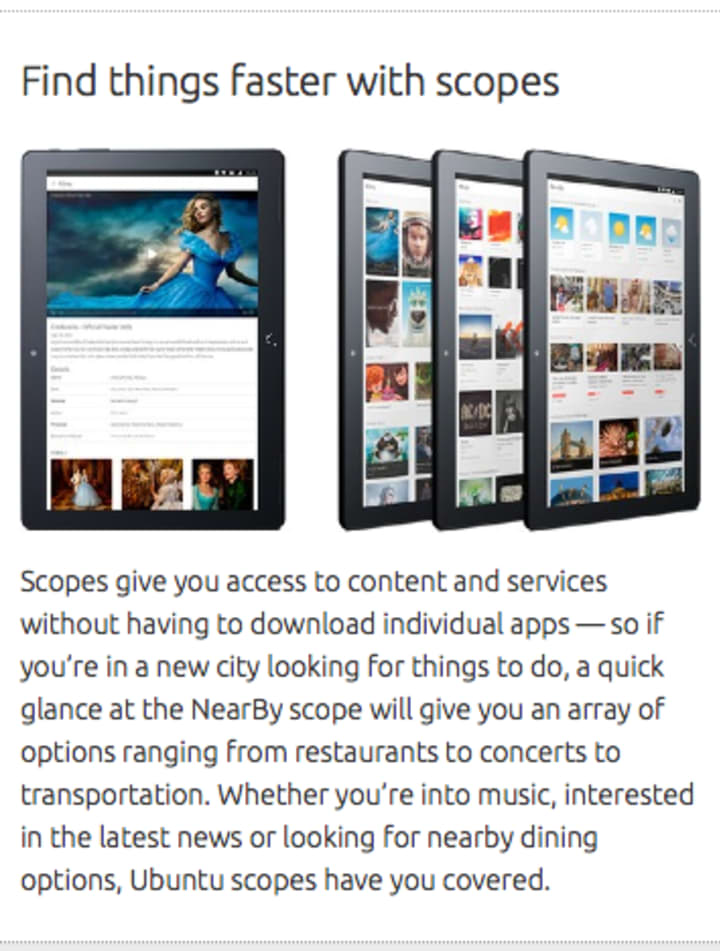
To showcase the beautiful tablet screen designs on the new BQ tablet, we coordinated with professional photographers to deliver the stunning images of the real device that you can enjoy along every new page of the section.
 One of the many beautiful device photos used across the new tablet section of ubuntu.com
Many people were involved in this project, making it possible to deliver a redesign that looks great, and is completed on time — which is always good a thing 🙂
In the future
In the near future, we want to remove the container box from the other sections of ubuntu.com, although you may see this change being done gradually, section by section, rather than all in one go. We will also be looking at redesigning our navigation, so lots to look forward to.
Now go experience tablet for yourself and let us know what you think!


